Ad Hoc LLC / Product Design
Unblocking U.S. Veterans from accessing their benefits online
Unblocking U.S. Veterans from accessing their benefits online
Untangling complex login errors and giving Veterans clear steps to resolve them.
Challenge: When Veterans encountered contextual next step prompts or errors related to accessing a VA.gov health tool, they were unsure how to move forward.
Challenge: When Veterans encountered contextual next step prompts or errors related to accessing a VA.gov health tool, they were unsure how to move forward.
My Role
My Role
I was the primary product designer and researcher.
I was the primary product designer and researcher.
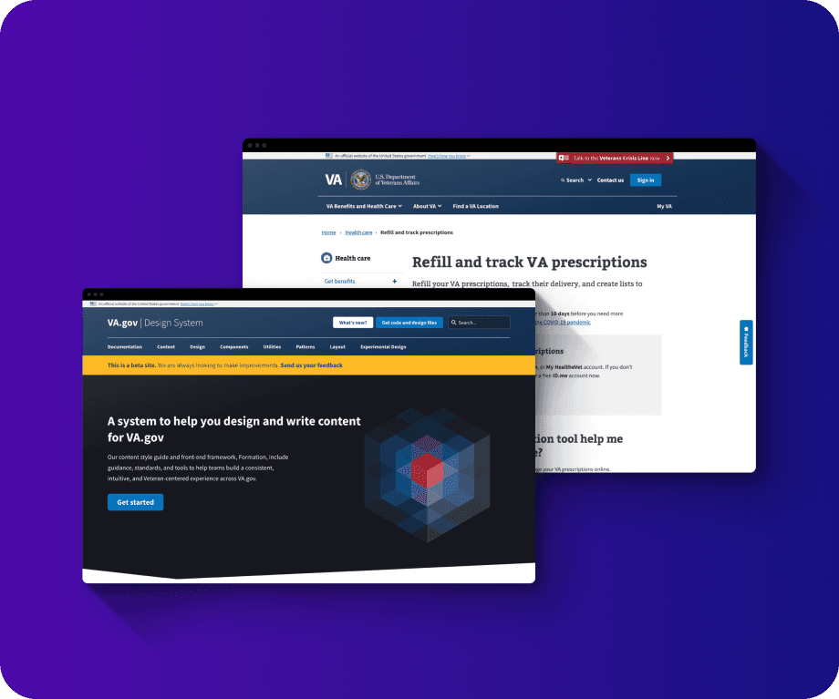


Screenshots from design.va.gov and va.gov.
Research
Research
After conducting remote usability testing with Veterans, I learned that contextual messaging, meant to guide them forward, was completely missed.
After conducting remote usability testing with Veterans, I learned that contextual messaging, meant to guide them forward, was completely missed.
Untangling Confusing Processes Behind the Scenes
Untangling Confusing Processes Behind the Scenes
I worked with my team to understand how the system worked and how we could feasibly improve it. I made a map of each error scenario that Veterans would face on VA.gov.
I worked with my team to understand how the system worked and how we could feasibly improve it. I made a map of each error scenario that Veterans would face on VA.gov.
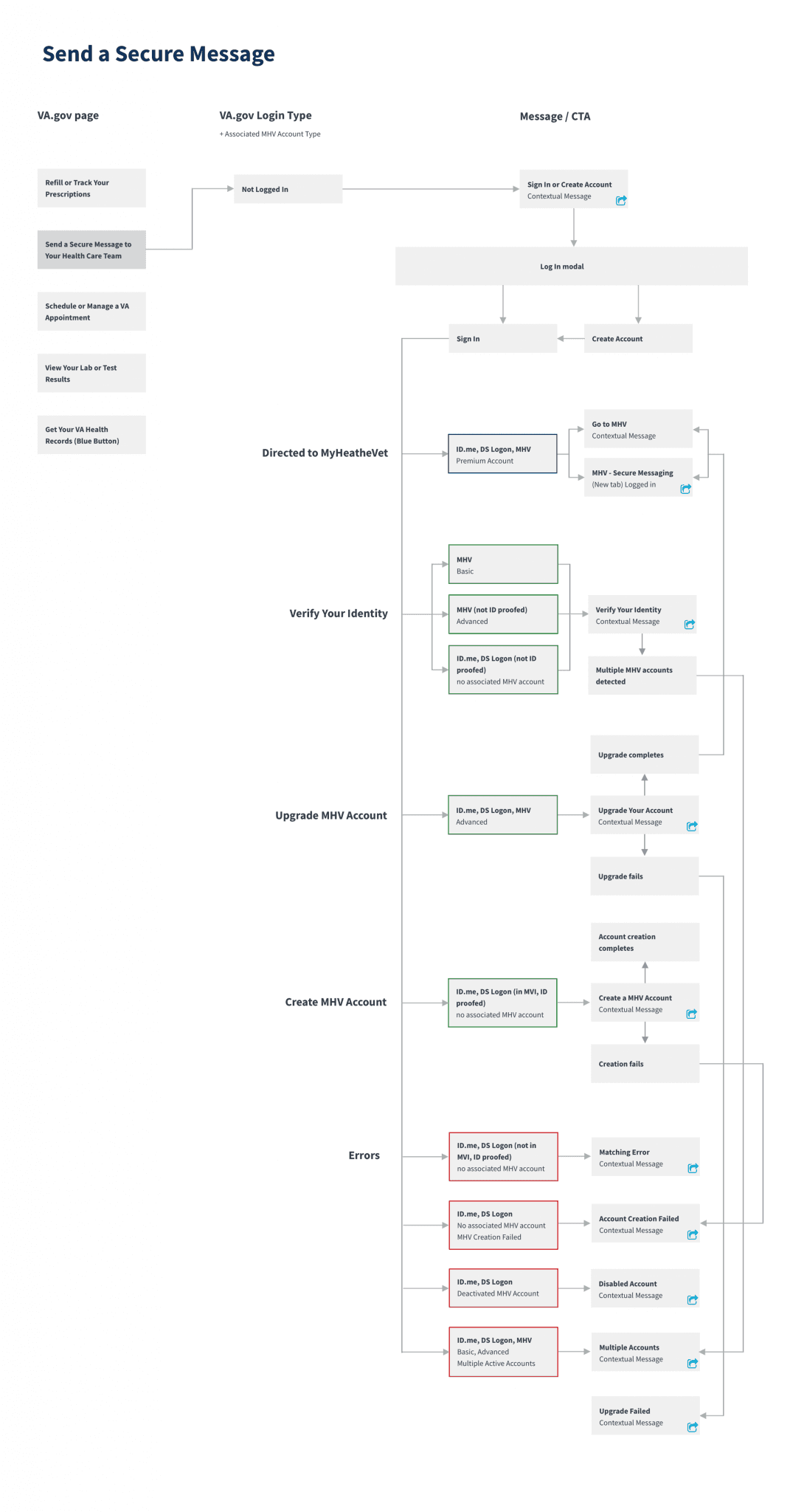


A workflow diagram of a contextual login error scenario on VA.gov.
Design Improvements
Design Improvements
I redesigned contextual error messages to included less red to reduce Veterans’ anxiety when encountering them. (These visual updates were also updated in VA.gov’s design system.)
We also rewrote the content of the error messages so that we could walk Veterans through the steps needed to get through a phone tree or fill out a Help Desk request form.
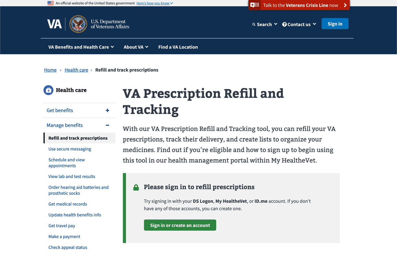


Example of a redesigned contextual message on VA.gov, prompting Veterans to sign in or create and account.
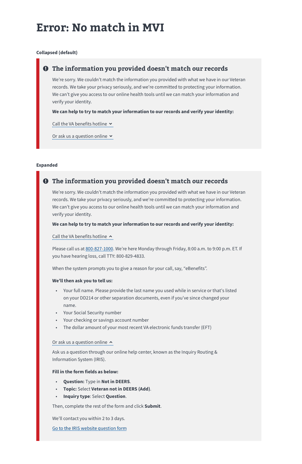


Example of a collapsed and expanded version of an error message that includes a path forward for Veterans.
Lessons Learned
Lessons Learned
To some, this work may seem dry or dull. Who cares about an error message? It's just words, right?
But after witnessing how often they were blocked from the benefits they earned, giving U.S. Veterans a better path forward was profoundly gratifying and impactful.
To some, this work may seem dry or dull. Who cares about an error message? It's just words, right?
But after witnessing how often they were blocked from the benefits they earned, giving U.S. Veterans a better path forward was profoundly gratifying and impactful.
© LaylaUX LLC 2025 | Austin, Texas
© LaylaUX LLC 2025 | Austin, Texas
© LaylaUX LLC 2025 | Austin, Texas