H-E-B / Product Design
Launching a mobile shopping list for efficient shopping trips
Launching a mobile shopping list for efficient shopping trips
Designing and implementing a mobile shopping list solution on a tight deadline.
Challenge: The new My H-E-B native app was launched without the shopping list feature, which a niche group of customers loved and used. We were getting really low scores in the App Store and Google Play store due to its absence in the app.
Challenge: The new My H-E-B native app was launched without the shopping list feature, which a niche group of customers loved and used. We were getting really low scores in the App Store and Google Play store due to its absence in the app.
My Role
My Role
I was the sole lead designer, collaborating with the Product Manager and iOS and Android developers on my team.
I was the sole lead designer, collaborating with the Product Manager and iOS and Android developers on my team.
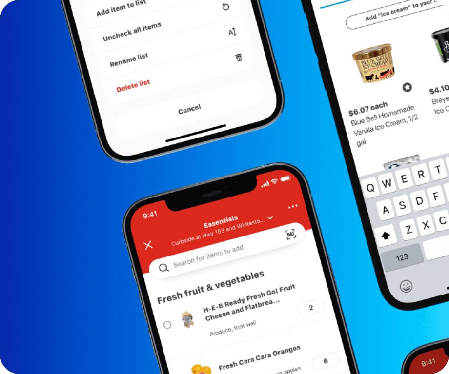


Mockups of the final shopping list designs.
Design Strategy
Design Strategy
Reuse existing design patterns from the new My H-E-B app to design the shopping list quickly
De-emphasize the store and fulfillment method affordance to prevent confusion
Create an in-store fulfillment method, especially for customers who like to use their devices while shopping at the store
Reuse existing design patterns from the new My H-E-B app to design the shopping list quickly
De-emphasize the store and fulfillment method affordance to prevent confusion
Create an in-store fulfillment method, especially for customers who like to use their devices while shopping at the store
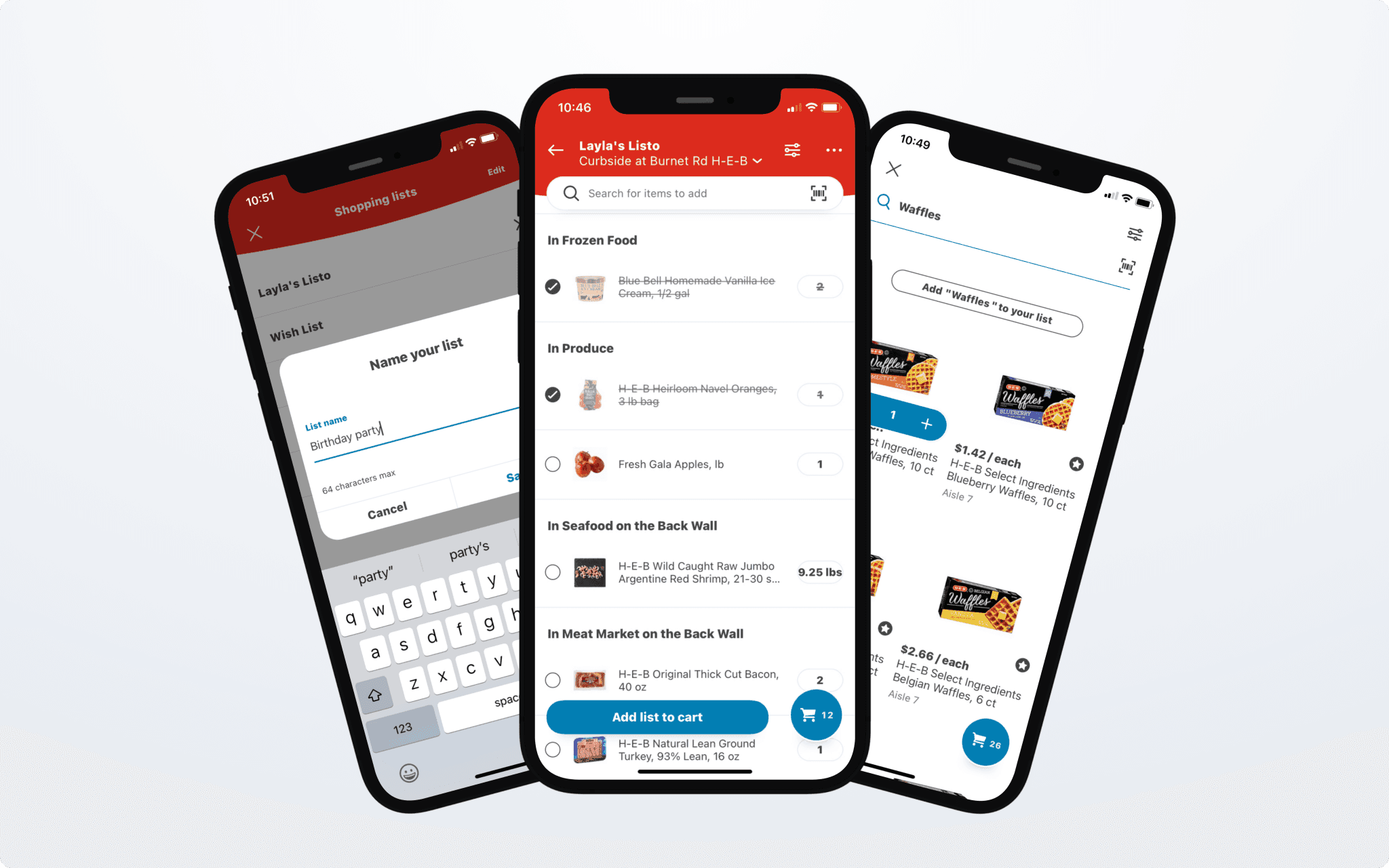


iOS shopping list designs, including a shopping list with checked-off items, search, and add a new list.
Design Research
Design Research
Usability studies on initial designs showed that customers were confused about selecting a store and fulfillment method before interacting with the list.
They were also confused by the “Add list to cart” button, especially if they were primarily in-store shoppers. After the initial launch, it was clear that we needed to add an in-store mode to the mobile app.
Lessons Learned
Lessons Learned
Context can make a huge difference in a customer's experience.
We missed giving in-store shoppers the ability to sort their shopping lists by aisle. (They let us know pretty quickly, and we added it as a fast-follow.)
What's the difference between a shopping list and a cart? Many people aren't sure.
Customers don’t think about store location or fulfillment type when they use the mobile app. We needed to reconsider store and fulfillment type holistically, across the native mobile app and HEB.com, because it impacts many features (beyond shopping lists).
© LaylaUX LLC 2025 | Austin, Texas
© LaylaUX LLC 2025 | Austin, Texas
© LaylaUX LLC 2025 | Austin, Texas