H-E-B / Product Design
Winning digital customers in a new market with a promotional website
Winning digital customers in a new market with a promotional website
Opening a new H-E-B grocery store in Lubbock, TX and entering a new market for the first time in over 25 years.
Challenge: Drive potential customers to actively and repeatedly engage with H-E-B's digital properties four weeks before the grand opening of the new Lubbock store without sharing assortment or pricing.
Challenge: Drive potential customers to actively and repeatedly engage with H-E-B's digital properties four weeks before the grand opening of the new Lubbock store without sharing assortment or pricing.


Final desktop and mobile designs of the Savings page on the Lubbock website. Users clip the weekly coupon and return to the website the next week to clip a new coupon.
New App Downloads
35k
35k
Over 4 weeks
16% over goal
Account Creation Rate
27.16%
27.16%
26% over goal
My Role
My Role
As the lead designer, I worked hands-on with a Content Designer and Product Designer to create IA, wireframes, and final designs while also working diligently with other teams and leadership at H-E-B so we could launch a quality responsive web app on time.
As the lead designer, I worked hands-on with a Content Designer and Product Designer to create IA, wireframes, and final designs while also working diligently with other teams and leadership at H-E-B so we could launch a quality responsive web app on time.
The Original Ask
The Original Ask
Our stakeholders, unfamiliar with the experience design process, asked our product team to add a coupon to the mobile app for new customers in the Lubbock area.
Since product assortment wasn't available until 48 hours before the store's grand opening, we would need another way to keep new customers engaged with the app.


Mural board with journey map activity. A grid divided by phases at the top and user modes (doing, thinking, feeling) and opportunities along the left side.
Solution
Solution
Our team used this project as an opportunity to showcase our capabilities to create an engaging and unique digital-first experience to new H-E-B customers.
We designed and built a temporary micro-site tailored to Lubbock, allowing potential new customers to learn about their new H-E-B store, earn coupons after creating a digital account, and return each week to collect newly revealed coupons.
Design Goals
Design Goals
Make a positive first impression
Encourage account creation
Make it "sticky"
Build customer loyalty
Make a positive first impression
Encourage account creation
Make it "sticky"
Build customer loyalty
Design Process
Design Process
Facilitate a design thinking exercise with partners
Define design goals
Propose IA, content strategy, and initial designs
Polish final designs
Facilitate a design thinking exercise with partners
Define design goals
Propose IA, content strategy, and initial designs
Polish final designs


Lubbock website information architecture diagram
IA & Content Goals
IA & Content Goals
Tells the story of this unique store and H-E-B as a Texas company
Draws curiosity and excitement about H-E-B's Lubbock arrival
Answers users’ most important questions
Highlights H-E-B's most beloved features and products
Offers incredible savings to drive account creation
Tells the story of this unique store and H-E-B as a Texas company
Draws curiosity and excitement about H-E-B's Lubbock arrival
Answers users’ most important questions
Highlights H-E-B's most beloved features and products
Offers incredible savings to drive account creation
Wireframes
Wireframes
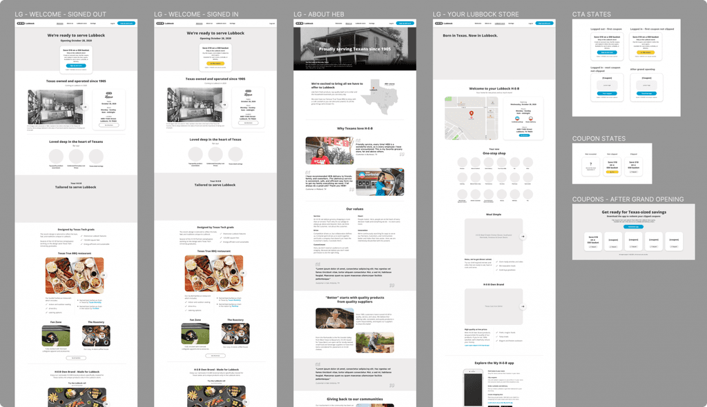
I worked with a Content Designer to design the wireframes and shape the content strategy.
I worked with a Content Designer to design the wireframes and shape the content strategy.
Final Designs
Final Designs
Based on the wireframes, another product designer completed the final designs while I pushed to get quality marketing assets and content from the Marketing and Coupons teams.
Based on the wireframes, another product designer completed the final designs while I pushed to get quality marketing assets and content from the Marketing and Coupons teams.


Lubbock website wireframes and draft content
Lessons Learned
Lessons Learned
Earning Respect: Showcasing the Digital Product Team's capabilities in design thinking, product strategy, and collaboration earned respect from the more tenured departments at H-E-B, paving the way for future collaboration and teamwork.
Building a Repeatable Model: We could take wins from the Lubbock site and try them on heb.com. Also, the Lubbock micro-site strategy was used as a template for launching into other new markets.
© LaylaUX LLC 2025 | Austin, Texas
© LaylaUX LLC 2025 | Austin, Texas
© LaylaUX LLC 2025 | Austin, Texas