Figma / Accessibility
Crafting a strategic product plan from a comprehensive accessibility audit
Crafting a strategic product plan from a comprehensive accessibility audit
Understanding accessibility opportunities in Figma and FigJam.
Challenge: Figma completed an accessibility audit of their products and marketing website revealing over 2,400 accessibility issues.
The audit helped Figma understand the categories of issues to fix, but it didn’t paint the full picture of how people with disabilities expect to use Figma and FigJam.
My Role
My Role
I was the primary researcher during a 6-week contract.
I was the primary researcher during a 6-week contract.
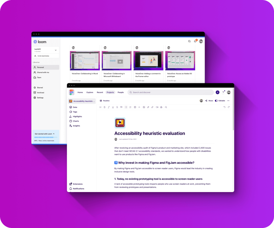


Screenshot of Accessibility Heuristic Evaluation created in Dovetail and a screenshot of Loom demos of screen reader issues in Figma.
Goal
Goal
Articulate the most critical accessibility issues and offer recommendations to help Figma’s leadership team understand the scope of accessibility effort needed in 2022 to make progress on these prioritized flows.
Articulate the most critical accessibility issues and offer recommendations to help Figma’s leadership team understand the scope of accessibility effort needed in 2022 to make progress on these prioritized flows.
Plan
Plan
Since we knew Figma and FigJam have many existing accessibility issues, we deemed it unuseful to conduct usability testing with assistive tech users and the current product and website.
Instead, we focused on evaluating current Figma workflows with VoiceOver and keyboard navigation for prioritized workflows:
A screen reader user reviews a shared prototype
A screen reader user posts feedback on designs in the editor
A screen reader user collaborates in FigJam
Next, we evaluated the same workflows in competitor products to understand what we might borrow and where we have opportunities to create better experiences for screen reader users.
Additionally, since we knew Google had a great reputation for inclusive design and accessibility, we conducted an unmoderated usability study with a screen reader user interacting with Google Slides.
Documenting Workflows and Obstacles
Documenting Workflows and Obstacles
Using Loom to record myself, I tested various workflows using keyboard-only and VoiceOver (a screen reader) to document obstacles.
Using Loom to record myself, I tested various workflows using keyboard-only and VoiceOver (a screen reader) to document obstacles.
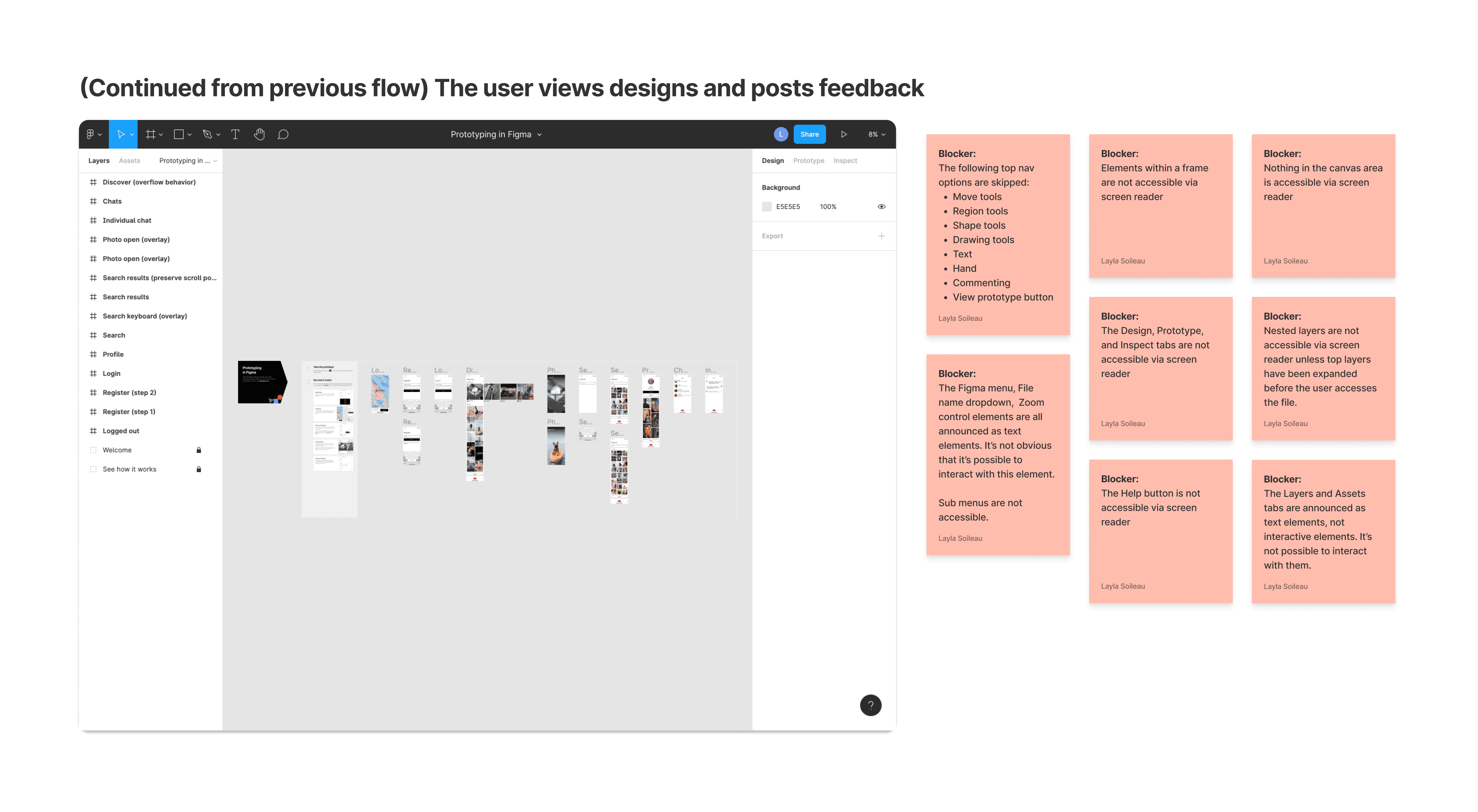


Screenshot of a step in a screen reader user's Figma journey and notes about obstacles or blockers.
Documenting Recommendations
Documenting Recommendations
I documented my overall findings using Dovetail, which allowed me to link Loom reference videos and Figma documentation when appropriate.
I documented my overall findings using Dovetail, which allowed me to link Loom reference videos and Figma documentation when appropriate.


Documented recommendations for improving Figma's prototyping product.
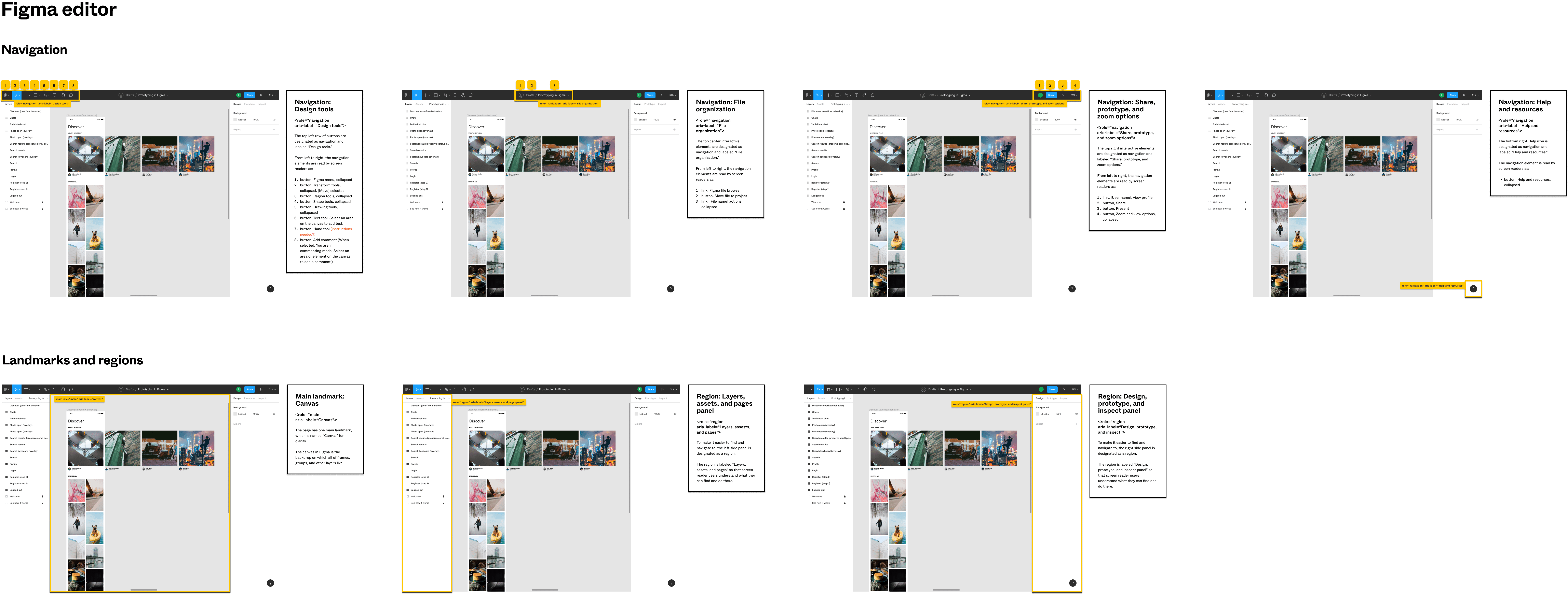


Documented recommendations for improving Figma's editor product.
Lessons Learned
Lessons Learned
Talk to actual assistive technology users.
I'm not your typical assistive technology user, and although I learned a ton from testing workflows on my own, I'm sure there were gaps.
Accessibility role models are hard to find.
Even companies with robust accessibility programs (like Google) have room to improve products for assistive technology users. Don't copy anyone, but if you do, be sure to validate your designs.
Figma's developers were excited and proactive about fixing accessibility issues.
Engineers used my Loom demos to understand and fix issues during an innovation sprint. Some issues were fixed before I finished writing my final recommendations!
© LaylaUX LLC 2025 | Austin, Texas
© LaylaUX LLC 2025 | Austin, Texas
© LaylaUX LLC 2025 | Austin, Texas